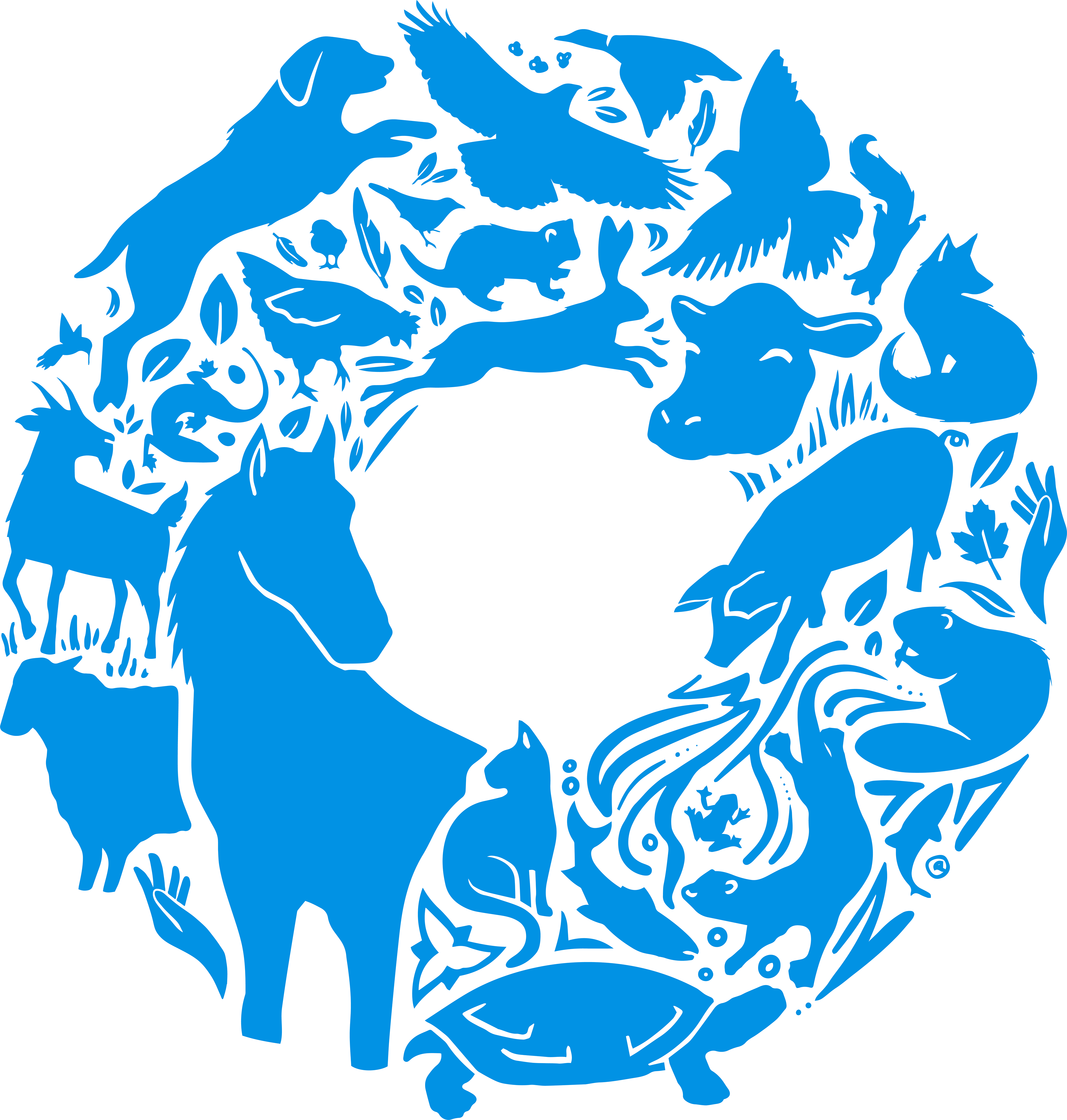
Our new icon celebrates the rich variety of life in our province, in our veterinary practices and in our association. We are, by nature, a singular entity made of multiple parts, and our visual identity reflects and honours that abundance.
Our icon takes the shape of an “O”, functioning both as a clear reference to Ontario and as a symbol of wholeness. Its dynamic illustrative style has a clear, lively warmth, but is not so stylized as to become dated quickly. The animals featured span the wide variety of veterinary specializations in Ontario, ensuring that the design speaks to the rich diversity present in our membership. Human hands and other symbols of the natural world are woven throughout, including specific geographical references to Ontario’s natural beauty. All of these individual elements flow together to create a unified form, representative of the interconnectedness of human, animal and environmental health.
We use blue for continuity, to tie the past OVMA to the future, and yellow to signal interactivity and energy. While we honour our roots, which date back to 1874, we are intentionally forward-thinking and focused on innovation—we continue to grow, change and stay curious about what the next 150 years will bring.